Monday 30 August 2010

Envelope

The brief says that the pack has to be mailable so I decided that the folder containing all of the printed matter will be packaged in a black metallic bubble envelope. I ordered a pack of six 242mm x 330mm envelopes from eBay for £10.


I want to make the address label look a bit special so I bought some gold paper from Paperchase to print onto. These are some of the labels I designed. Its hard to tell what will look good on the envelope so I will print all of these out and photograph them to see which one works best.

Folder


This was the first folder I made for the magic kit. It was just plain and black. It also didn't fit the poster in correctly and was a bit crappy looking because I didn't cut the slots properly. So I decided to remake it. It looks a lot better now.


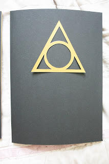
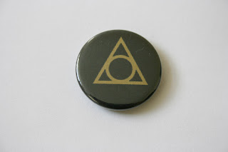
Here it is with the entire contents. I even affixed one of the badges to the side panel. When put together with the rest of the kit, the badge doesn't look so bad. I'm happy with how this looks now. However, the cover of the folder is still plain black and looks boring. I originally wanted to have the triangle logo on the cover, either embossed or with just a spot varnish to make it look really flash. But I don't have access to these facilities so I decided to do some paper cutting.


I wanted to cut into the cover and have gold behind it but when I tried it out, I realised that you only get the inner pattern, not the outer triangle so it doesn't really look much like the logo. Therefore I cut the logo out of gold card and will stick this to the cover.

Badges


I got my badges back from koolbadges.co.uk. They look really crap. It looks like they printed it on a normal inkjet printer. The text/images look slightly pixellated despite being illustrator files! They'll have to do though because the deadline is too near. At least these give a clear picture of how they would look if they were printed professionally.

Friday 27 August 2010

Booklet Reprinted


Today I received the final copy of the magic booklet printed by lulu.com. Here it is with my design context book. The cover is on nice glossy paper so it looks really professional.


The main reason I wanted to get it printed professionally is because when I printed it in the dungeon, the bleed and margins got messed up so the text was far too close to the edge. Now the margins look how I intended them to. The only problem with the booklet now is there is one random white page at the back of the book. This is because when I worked it out to be printed in the dungeon, the backs of the cover spread were also printed onto. Because lulu.com don't print onto the back of the cover, the pagination got messed up slightly so they added an extra page. Otherwise, I'm very happy with the outcome.