Sunday 31 January 2010

Pack Contents


Been thinking about what things to include within the information pack for Maleficium. I have to produce at least 4 printed items which definitely must include a promotional poster and a membership card. I think its a bit odd to do a promo poster considering its a kind of secret society but I think I can make it intriguing or perhaps use a code that you have to break to understand what its promoting. I definitely want to create a booklet with information about the club, history of magicians, how to do certain tricks etc. I'm leaning towards the final item being a membership certificate but not quite decided yet.

Saturday 30 January 2010

More Logo Devlopment

Tried creating some more logos using geometric shapes. I don't think that these are as successful as my previous attempts.


So for the logo I have decided to go with one of the triangles below and one of the text logos. Now I just have to sort out the Maleficium logo part.

The Alliance Text Logo


Out of all the fonts I tried that I thought would be appropriate for this text logo, I felt that Century Gothic had the look I wanted. It has the pointedness of Futura but is a bit more rounded. I tried this with a thin and a thick line but think the thin looks better. Then I played around with how the line(s) could be positioned around the text.

Friday 29 January 2010

Vector Logos


Put some of my ideas into Illustrator as I thought I would be able to make a better decision once they were vectorised and not crappily hand drawn. At the moment I'm leaning towards the triangle with the circle in. Its very plain so it could be for anything but it has a deeper meaning as it is one of the symbols used by King Solomon when summoning demons. Its mysterious... I'll try to develop these some more, to make sure I make the right decision.

Thursday 28 January 2010

Logo Ideas


Some logo ideas for the society. I have decided to call the society 'Maleficium' which is a Latin word for mischievous magic. However because the society is supposed to be quite secretive and mysterious it will also go by the name 'The Alliance'.

Wednesday 27 January 2010

Magic Imagery


Came up with some initial names and images that could be used as a part of the magic society's identity. I like the idea of using symbols associated with proper magic as opposed to cheesy traditional stuff like top hats and wands. These symbols would add to the air of mystery about the club.

Tuesday 26 January 2010

Experiments


Couple of quick tests of type and heart patterns. I think I might try doing some more heart pattern experiments as they could work as backgrounds or could fill the definitive stamp next to the long rectangular one. If I go for the type one, it has to work at a really small scale, when I zoomed out on this one it didn't really look that good...

Stamp Dimensions

Portrait = 27mm x 37mm
Landscape = 41mm x 30mm
Square = 35mm x 35mm
Definitive = 20.3mm x 24.1mm
Definitive + Rectangular = 20.3mm x 24.1mm + 50mm x 24.1

I like the definitive + rectangular sizing as it allows me to create two different images or add some informative text. I think I'll have to see what works best with my ideas though.

Stamp Themes


Came up with some ideas that I could use for my postage stamps. Royal Mail have certain kinds of things they make stamps for and they need to appeal to a broad range of people.


Showing pride for your home town through a stamp was one idea, but rather than one set, many would have to be created to accommodate for all the places in the UK. Too big a task I think.


Could show my support for the Tory party but this will only appeal to conservatives and not everyone is keen to show their political allegiance.


I think Valentine's Day could be a good theme as it is quite universal (well if you like someone/are in a couple!). I like the idea of using famous couples as examples for your love.


It was quite hard to find couples as people tend to split up, another alternative could be my 'I love you more than...' idea as these are just things people love like chocolate rather than couples which are more temperamental. I think I will try experimenting with visuals for both of these ideas.

Monday 25 January 2010

Tickets

Decided to go with the tearaway strip idea. I like the way it would remove the middle of the M:S hallmark. Underneath the strip would be white or blue. I tried the tickets in white because I like the idea of the blue being revealed behind it. The blue goes more with the rest of the exhibition's visual identity though. Not sure which looks best so I think I'm gonna test it out before I take them to the digital print room.

Blue tickets:


White tickets:


Friday 22 January 2010

Ticket Backs

Decided to go with the rectangular 15x7cm tickets rather than the square 8x8cm ones as this is a more traditional ticket format so it would be easier to recognise as an actual ticket. Here are some backs I designed for them. The back will be printed in greyscale to reduce printing costs and show that this is the less important side of the ticket.


I think I like the 3rd one best. It has a clearer layout than the others and I think the hallmark background is too distracting even when reduced to a very light tint.

Wednesday 20 January 2010

Ticket Sketches


Some sketches for ticket designs. Decided not to take too long doing these as that was one of my main downfalls last module. Gonna do the colours on InDesign, I've sped up my design process already, yay. I took inspiration from my idioms project in how I've decided to perforate the top layer on some of the designs and when that bit is torn away the ticket is no longer valid. Should look good.

Umbrella Statement

Type and layout for publication design with an emphasis on grids/modernism.
Editorial/informative graphic design.

Monday 18 January 2010

Yin Yang So Far...

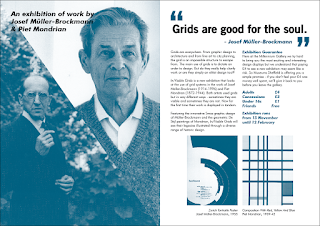
So in the last module I created the promo and wall proposals for my exhibition. This is what I produced:

Context:


Posters:


Flyer:


Leaflet:


Walls:


Next I need to create the ticket, then the catalogue and an innovative piece of merchandise.